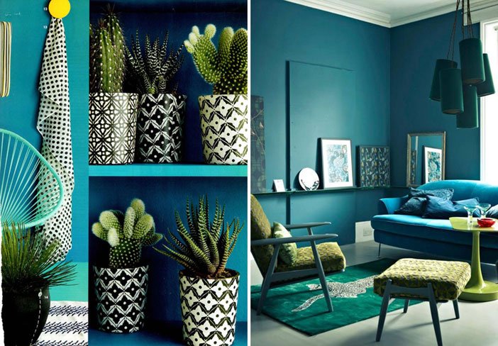

This March 2015 was the first year that I’d noticed the interesting International Colour Day. The day prompted a lot of discussion on interior design forums and it seems that each year the industry is embracing colour to a whole new level. Crown Paint, Valspar Paint and Dulux have all launched their individual campaigns highlighting the importance of colour, with the latter warning that we are sleepwalking into a future without colour, enticing us to become ‘colour rebels.’ Colour really is one of the best ways to add that personal touch to your home. But just how can we do this without making an almighty mess of our home refurbishment Leicester?
Start small
If your home is understated and filled with neutral tones, try to identify a statement piece to catch the eye. How about a chest of draws in the living or dining space with each draw painted a distinct colour. Perhaps start with yellow at the top, moving through some greens and finishing in blue. The sides, top and back of the chest can all be painted one subtle shade of greenish blue – perhaps the same as the penultimate draw? If this seems too audacious, perhaps start with introducing some flowers in a colourful, bold vase or some coloured cushions.
Big in 2015
This year we have seen the trends shift away from the nondescript cream and beige palette to a cooler set of colours such as silvers, fresh whites and greys. This trend is in keeping with the idea of bringing the industrial into the home. On the fringe of the more popular choices there is a real buzz about using colourful ‘artist palette’ designs against a backdrop of icy white.
Blinds
Sometimes the very nature of an accessory lends itself to colour experimentation. Window blinds are a clear choice when to create a bold impression in an interior because of their ‘blocky’ look. It is also easy to use colour contrasts or combinations, by using a border on a roller blind or alternating slat colours.
Kitchen mix
Colour mixing in the kitchen has been on the rise of late and helps kitchens look less ‘out of the box.’ The most obvious way to achieve this is with the units. A blend of oak and hand painted units can look lovely. This introduces a homely feel and elegant shades of blue and grey can look great against a predominant oak set-up. The great advantage to this is the colour can be changed in the future, giving you a relatively cheap freshen-up option going forward.
